UI / UX 101 - Spacing

Basic UI knowledge
Layout
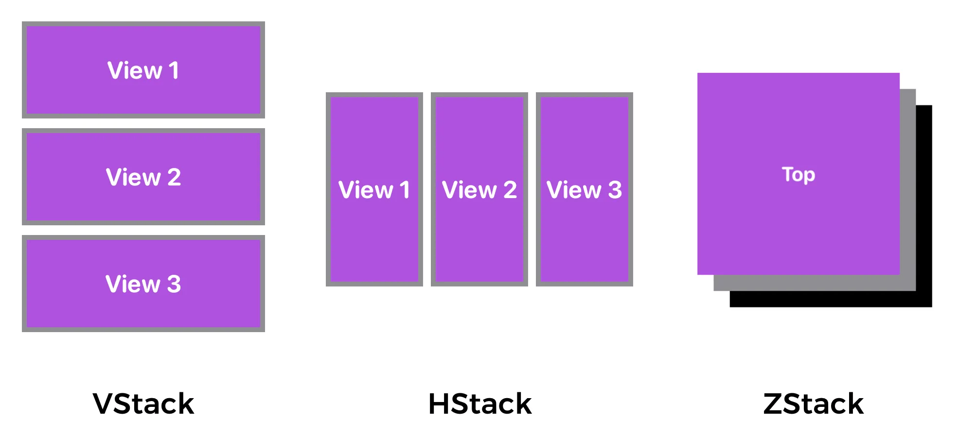
Theoretically, there are only 3 fundamental UI layouts:
- HStack — arranges the views horizontally
- VStack — arranges the views vertically
- ZStack — overlays one view on top of another
However, the names of these layouts may not be the same in all UI systems. While the names vary, here are some common types of specialised layouts you'll encounter in different UI frameworks:
Grid Layouts: These are essentially a more structured way to arrange items in both rows and columns. They can be thought of as a combination of HStacks and VStacks, but with built-in mechanisms for aligning items across cells, spanning multiple cells, and handling responsive resizing. Examples include (Android), (WPF/UWP), (iOS/UIKit), or CSS Grid.
Flow Layouts: Unlike strict grids, flow layouts arrange items in a continuous flow, wrapping to the next line or column when space runs out. This is particularly useful for displaying collections of items that may vary in size, like tags or image galleries. Think of how text wraps in a paragraph. Examples include (web CSS), (iOS/UIKit can behave this way), or a (WPF/UWP).
Since the screen size of users' devices may vary, the responsive system was invented. This approach, often called Responsive Web Design (RWD), isn't a separate technology but rather a collection of techniques and best practices to ensure that a website or application's layout and content adapt seamlessly to different screen sizes, resolutions, and orientations. The goal is to provide an optimal viewing and interaction experience for every user, regardless of the device they're using.
We will talk about responsive design in subsequent chapters.
Space between elements
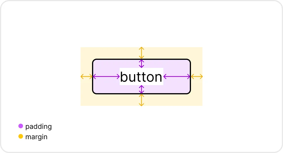
Spacing in UI design is like the air in a room - you don't always notice it, but it's essential for comfort and clarity. Here's why it's important: Improves Readability and Comprehension:
- Reduces clutter: Proper spacing prevents elements from feeling cramped and overwhelming. This makes text easier to read and allows users to quickly scan and understand information.
- Creates visual hierarchy: Spacing helps to group related elements and separate unrelated ones, guiding the user's eye and highlighting important information.
To be closer, or not to be closer?
Closer:
- Grouping: Elements that are visually closer together are perceived as related. This is the principle of proximity. Think of a form with labels and their corresponding input fields – they should be close to show they belong together.
- Hierarchy: Closer spacing can also indicate a tighter relationship in a hierarchy. For example, a heading might be closer to its subheading than to the next section of content.
- Emphasis: Sometimes, you might want to bring elements closer to create a sense of focus or urgency. This can be used sparingly to draw attention to key actions or information.
Further:
- Separation: Elements that are further apart are seen as distinct and unrelated. This is crucial for separating different sections of content, navigation items, or interactive elements.
- Breathing Room: More space around elements creates a sense of openness and allows users to focus on individual items without feeling overwhelmed. This is often called "negative space" or "white space."
- Visual Hierarchy: Increasing the distance between elements can also emphasise a hierarchy by making certain elements stand out more. For example, a title with more space around it will appear more important than a paragraph with less space.
Example:
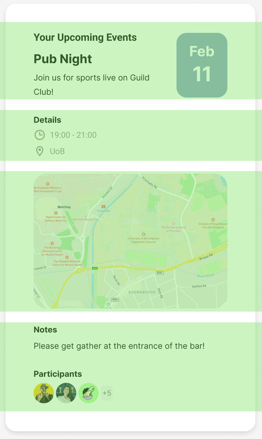
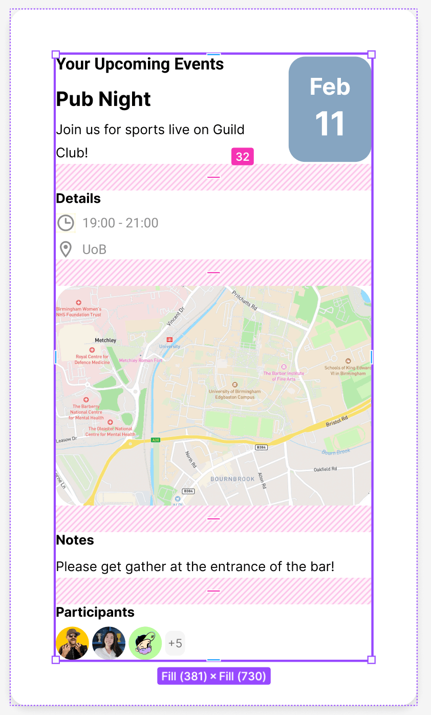
This example includes a component which is used to display details regarding an event. To effectively structure the component, it is imperative to execute precise segmentation prior to undertaking any subsequent steps.
Firstly, let’s clear out what should be displayed to users: Title, Date, Description, Time, Location, Note and Participants. We divide these items into sections. Note that if you are working on HTML, your HTML structure should be similar for better readability.
- Heading
- Notice
- Title
- Description
- Details
- Date
- Location
- Interactive Map component
- Note
- Participants
- User1
- User2
- Other users
Then, based on this segmentation, we could have this component:
Let’s see how we could apply HStack and VStack on this component.
If you look at the component shown below, you will notice that we could separate the whole container into different sections vertically.
However, if we take a closer look at the upper section, we also notice that it could be separate as two HStack. As you can imaging, the upper section is exactly composed of one HStack and a VStack.
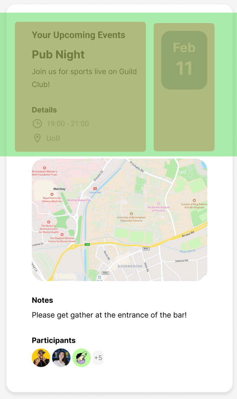
Ideally, the elements with same relationship should have same space size. Closer spacing between elements visually groups them, suggesting a stronger relationship or shared purpose. Wider spacing separates elements, indicating a weaker relationship or distinct functions.
More about correct spacing: https://medium.com/dwarves-design/the-principle-of-spacing-part-2-e3cf31b909fa
References:
- Image 1: Different types of stack view. Adapted from https://medium.com/@thanhtra.sqcb/swiftui-for-beginner-2-designing-ui-using-stack-views-ba3ac78bc82
- Image 2: Margin and Padding. Adapted from https://medium.com/@manonpiette.pro/margins-and-padding-e4e9d0efa65d